
Phyto
La puissance Végétale
Direction Artistique
Campagne publicitaire
Production Photos &Vidéo
Edition Luxe
Packaging
Merchandising
1ère marque à révéler la puissance végétale au service de la beauté des cheveux, PHYTO s’appuie sur deux savoir-faire uniques :
. Une approche scientifique par les plantes
. L'art du coiffeur pour sublimer les cheveux
Secret Professionnel by Phyto
Secret Professionnel by Phyto
Direction Artistique
Territoire de marque
Création des outils de communication print
Direction Artistique
Territoire de marque
Création des outils de communication print
« Il n’y a pas de beaux cheveux sans cuir chevelu sain » Patrick Alès
Secret Professionnel est la marque experte du soin des cheveux par les plantes. En 2018, elle confie à l'agence sa nouvelle identité de marque,
ainsi que la production de ses outils de communication.
« Il n’y a pas de beaux cheveux sans cuir chevelu sain » Patrick Alès
Secret Professionnel est la marque experte du soin des cheveux par les plantes. En 2018, elle confie à l'agence sa nouvelle identité de marque,
ainsi que la production de ses outils de communication.

Client : Mama Birth . Holistic Care for mothers and babies
Services : Brand Strategy | Brand Design | Visual Identity | Art Direction I Design Packaging
The Project
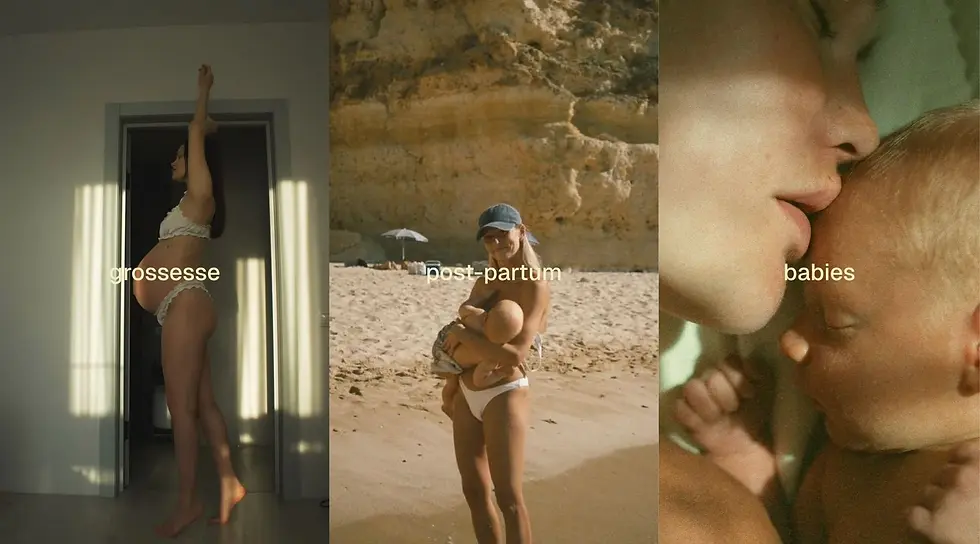
Mama Birth entrusted us with building a brand able to carry something as delicate and powerful as the path into motherhood. We began with brand strategy, defining the purpose, tone, and positioning before moving into design.
The visual identity centers on a custom wordmark, soft and confident, embodying both the maternal warmth and the clinical trust patients expect. A heart shaped icon, drawn like a comma, works as a standalone brand signature across small touchpoints, packaging, and digital.
The palette moves away from the classic pastel codes of the maternity sector. A warm ivory paired with a deep brown gives the brand a more premium, timeless, and reassuring feel. The signature line, "Holistic Care for Mothers & Babies," set in small tracked capitals, anchors the brand promise with quiet confidence.


Logotype & Visual Identity
The Mama Birth logotype was conceived as a soft, rounded mark: warm letterforms, gentle curves, a rhythm that feels held rather than sharp. A heart shaped icon, drawn like a comma, sits within the wordmark as its signature. It carries the reassurance of clinical care and the tenderness of early motherhood.


Brand Guidelines
The full brand system was consolidated in the Mama Birth Brand Guidelines, a complete reference covering logotype usage, typographic system, color and material palette, photographic direction, copywriting principles, and the editorial rules governing every print and digital touchpoint.
The visual language draws from a 1970s Los Angeles sensibility: warm ivory and deep brown tones, rounded organic letterforms, and a soft, sun washed photographic style that brings ease and nostalgia to the clinical world of maternity care.


Effortless Beauty, Honest care


